
Artwork is often approved as a design project and discovered as a manufacturing problem. A label that looks excellent on screen can lose small text on a curved bottle, trap bubbles under an adhesive panel, place a barcode too close to a seam, or leave no clean area for the lot code. Good private label packaging design starts by respecting the line that will make it.
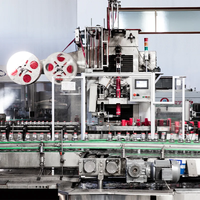
This guide shows how to turn brand direction into production-ready beer artwork without sanding away the personality of the design.
Contents
1. Start with the Container
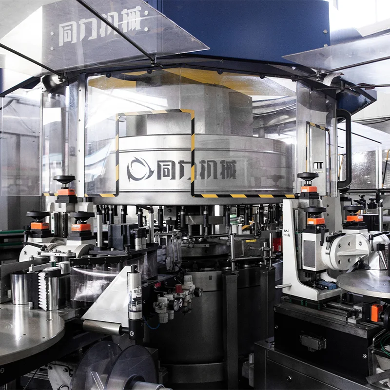
Lock the container, closure, label material and application method before final artwork. A shrink sleeve, pressure-sensitive label and paper glue label require different dimensions and tolerances. Obtain the manufacturer’s dieline and a physical blank for the design team.
Check the container’s panel curvature, shoulder, seam, base radius and viewing angle. A design that depends on a perfectly flat panel may need to be simplified on a tapered bottle.
2. Build a Clear Information Hierarchy
On shelf, the customer should recognize the brand, style and pack quickly. Place the most important message where it survives distance and condensation. Keep flavour, ABV and size readable without forcing the shopper to rotate the container.
Use a type system with a minimum size for legal text and a separate size for tasting notes. Avoid filling every millimetre. Empty space helps the mark and the product name remain legible.
3. Reserve the Legal Panel
Before polishing the front panel, list the destination-market requirements: product name, ingredients, allergens, alcohol statement, net contents, lot or batch coding, best-before format, importer details, recycling or deposit marks and language rules. Requirements vary by market, so confirm them with the importer and local adviser.
Create a compliance panel with enough contrast and a quiet area for the factory’s variable code. If the code is printed after labeling, allow for its actual size and position. A beautiful design that hides the date is not ready to manufacture.
4. Design for the Line
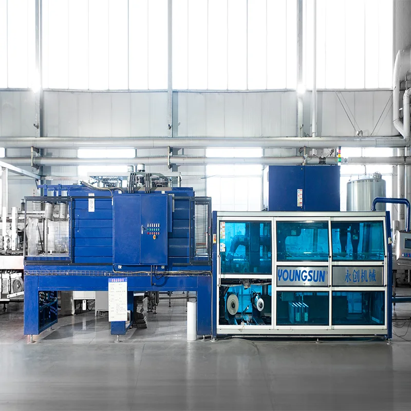
Ask the factory about label roll direction, gap, splice limits, application speed and acceptable registration tolerance. Confirm whether the barcode is scanned on the line and in the warehouse. Test dark colours, metallic effects and fine outlines under real lighting.
For cartons, specify print sides, case count, orientation arrows, lot visibility and pallet marks. The beer packaging options guide helps compare container and secondary-pack choices.
5. Approve the Right Proof
A screen proof checks wording and layout. A colour proof checks reproduction. A production-line sample checks the real substrate, adhesive, container and code. Do not let a PDF approval stand in for all three.
Use a dated approval form listing artwork revision, SKU, package, language, barcode and variable-code location. When the supplier or printer makes a change, issue a new revision rather than approving a change by chat.
6. Extend the Design to Cases
Cases are viewed from different angles and often sit in warehouses before reaching shelf. Keep the brand mark, product name and lot visibility clear on at least two sides. Use a consistent colour cue across flavours but make each SKU unmistakable to a picker.
7. Create a Handoff Pack
- Editable artwork and press-ready PDF;
- Fonts, linked images and colour references;
- Approved dieline with bleed and safe areas;
- Legal copy and translation approval;
- Barcode verification result;
- Variable-code specification;
- Physical proof photographs and signed revision sheet.
Send the handoff pack with the custom beer label design guide and the final RFQ so the brewery prices the same package you intend to produce.
Artwork Handoff Details That Save Rework
Name every variable element in the handoff: lot code, date code, importer line, flavour name and pack count. State whether each is printed by the label supplier, the brewery or a secondary printer. Include a marked-up PDF showing safe zones and a photograph of the real package with the code position circled.
For a multi-flavour range, create a master colour and typography sheet. It keeps the family recognizable while allowing the flavour cue to change. Ask the factory to confirm that the proposed colours remain distinguishable under warehouse lighting and after condensation.
The Production Proof Is the Final Design Review
At the production proof, inspect three things together: the artwork, the physical container and the variable code. Rotate the package under the lighting used in the warehouse and on shelf. Check that small legal text remains readable, the barcode scans, the label does not lift at the seam, and the code is not covered by the case or film.
Approve the proof with the SKU, revision, date and approver’s name. Store it with the purchase order. If the factory proposes a material or supplier substitution later, compare the substitute with this proof rather than approving it from a sample photograph.
8. FAQs
Can the designer use the supplier’s dieline?
Yes, but the factory must confirm that the dieline is current for the exact container and application equipment. Dielines change when a package or labeler changes.
Who approves regulatory text?
The importer or brand owner should own the market decision, with local regulatory or broker review where needed. The factory can flag production issues but should not be the only compliance reviewer.
Why do colours look different on the bottle?
Substrate, varnish, curvature, lighting and condensation all alter perception. A production-quality proof is the only dependable way to judge the finished effect.